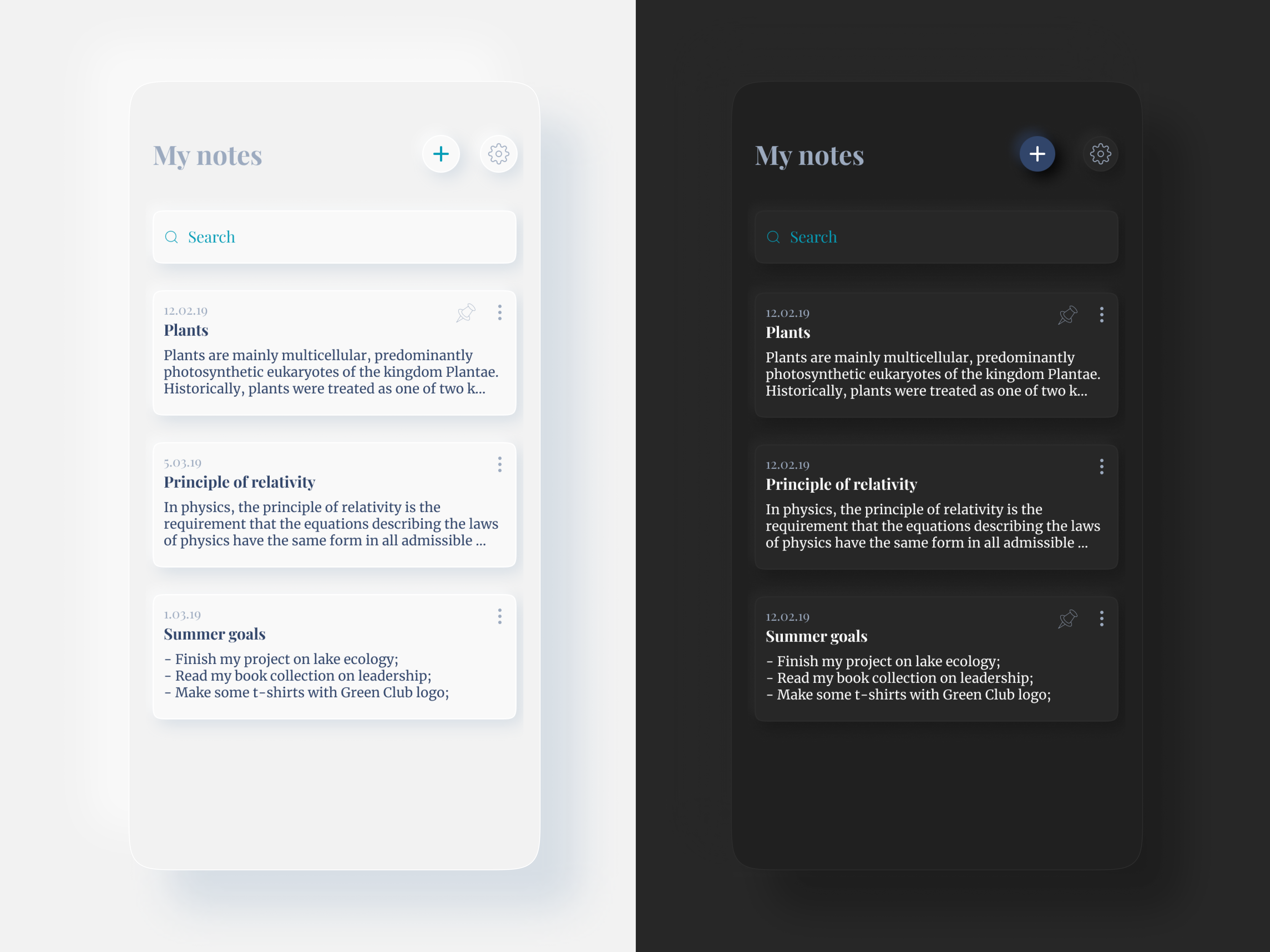
UI-concept, the source file is lost
The test work will consist of 3 stages:
1. Suggestions for improving the current application
The reality is that users need to be smoothly led to product changes; redesigns and functional changes often cause unpleasant emotions. So let's start small and see how we can, in the short term, improve the app for new users and make it more convenient for old ones.
2. Adapting the application to new functionality
Is the app ready for the new functionality? Is it flexible enough to grow successfully? And what can be changed without the need to hide useful new features in the burger menu?
3. Scanner Pro 2.0 Concept
Describe how I see the Scanner Pro of the future. Where to go and what functionality to implement in order to become a favorite scanner for users.
1. Suggestions for improving the current application
#1.1 Forming a product portrait
Basic information
Scanner Pro is a mobile PDF scanner known in its category. Relies on ease of scanning and storing documents, OCR and "Radar" functionality - automatic search for documents in the gallery
Scanner Pro is a mobile PDF scanner known in its category. Relies on ease of scanning and storing documents, OCR and "Radar" functionality - automatic search for documents in the gallery
Problematic moments
A large number of similar applications, UX obstacles on the surface, to add new features, you will have to re-equip the application
A large number of similar applications, UX obstacles on the surface, to add new features, you will have to re-equip the application
Task
Offer my vision of Scanner Pro, identify problems and propose a solution
Offer my vision of Scanner Pro, identify problems and propose a solution
Solution approach
Study the application and its competitors, conduct UX Mapping and understand what problems users face and how to solve (short term), modernize the application to conveniently add new features (medium-term) and offer a vision of the future Scanner Pro (long term)
Study the application and its competitors, conduct UX Mapping and understand what problems users face and how to solve (short term), modernize the application to conveniently add new features (medium-term) and offer a vision of the future Scanner Pro (long term)
# 1.2 Competitors
Microsoft Office Lens
Pros:
- Animated onboarding, "Start Scanning" button right on the onboarding;
- the user is immediately hooked up to the main flow ("photo - editing - saving") - they lead by the handle step by step;
- a very simple shooting screen: either add a photo or "Done".
- Animated onboarding, "Start Scanning" button right on the onboarding;
- the user is immediately hooked up to the main flow ("photo - editing - saving") - they lead by the handle step by step;
- a very simple shooting screen: either add a photo or "Done".
Cons:
- photos are not grouped;
- in principle, there is no functionality for displaying scans in the application.
- photos are not grouped;
- in principle, there is no functionality for displaying scans in the application.
Controversial:
- No skipping onboarding, immediately starting scanning (The hypothesis is convenient, and supports a plus in the next paragraph. It is necessary to check on users).
- No skipping onboarding, immediately starting scanning (The hypothesis is convenient, and supports a plus in the next paragraph. It is necessary to check on users).
Simplest application with one scan function. Everything else, in particular the section with scanned files, has been removed as unnecessary. I watched Nelly's persona in the process of use - the main flow was passed without difficulty, animated screensavers were viewed and helped to clearly understand the functionality
Adobe Scan
Pros:
- Without onboarding, directly to the scan;
- obvious automatic shooting - on the screen chip with the inscription "Search for document", when the document is found, a frame appears, loading and the chip "Shooting ... do not shake the camera";
- The most simple picture editing screen - save PDF at the top, edit and delete options at the bottom;
- The icons on the image editing screen are incomprehensible, and the application has to use text prompts;
- Very simple document screen.
Cons:
- Documents are divided into "Latest" and "All scans". Hypothesis - this can be canceled, for confirmation you need an AB-test of the prototype on users.
- Documents are divided into "Latest" and "All scans". Hypothesis - this can be canceled, for confirmation you need an AB-test of the prototype on users.
The application positions itself as an advanced scanner, but there is no text extraction. Overall, the design looks fresh and welcoming. There are controversial decisions.
Clear Scan
The application tries to solve the problem "one or several" - by default in camera mode there is an icon of one document, when clicked it turns into two. Arguably, you can do better. Clear handling. There is a selection of documents for longboarding tapu. Pay attention to the main screen - two buttons "Photo" and "Gallery".
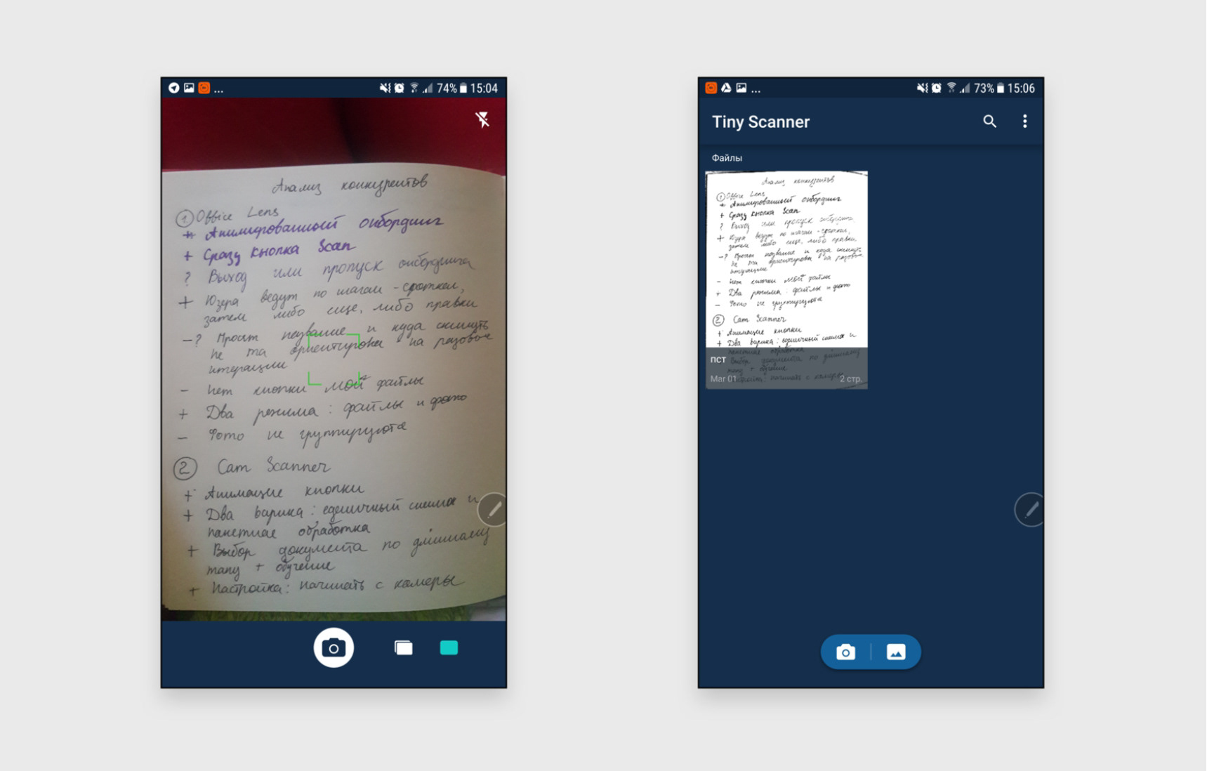
Tiny scanner
Take a look at the "photo \ gallery" on the main screen. On the shooting screen, two options are already visible - "one documentary or several". All in all, this is a brushed version of the previous Clear Scanner.
Cam scanner
An interesting way the application chooses to focus the user's attention on the FABs on the main screen - directs them to the corner with the art button to send the user there along this "path". On the shooting screen, the previous photo and the number "1" are sent to the left to avoid the user accidentally completing the set of photos due to the position on the right (we will see this problem later during user testing in Scanner Pro). The application has tooltips.
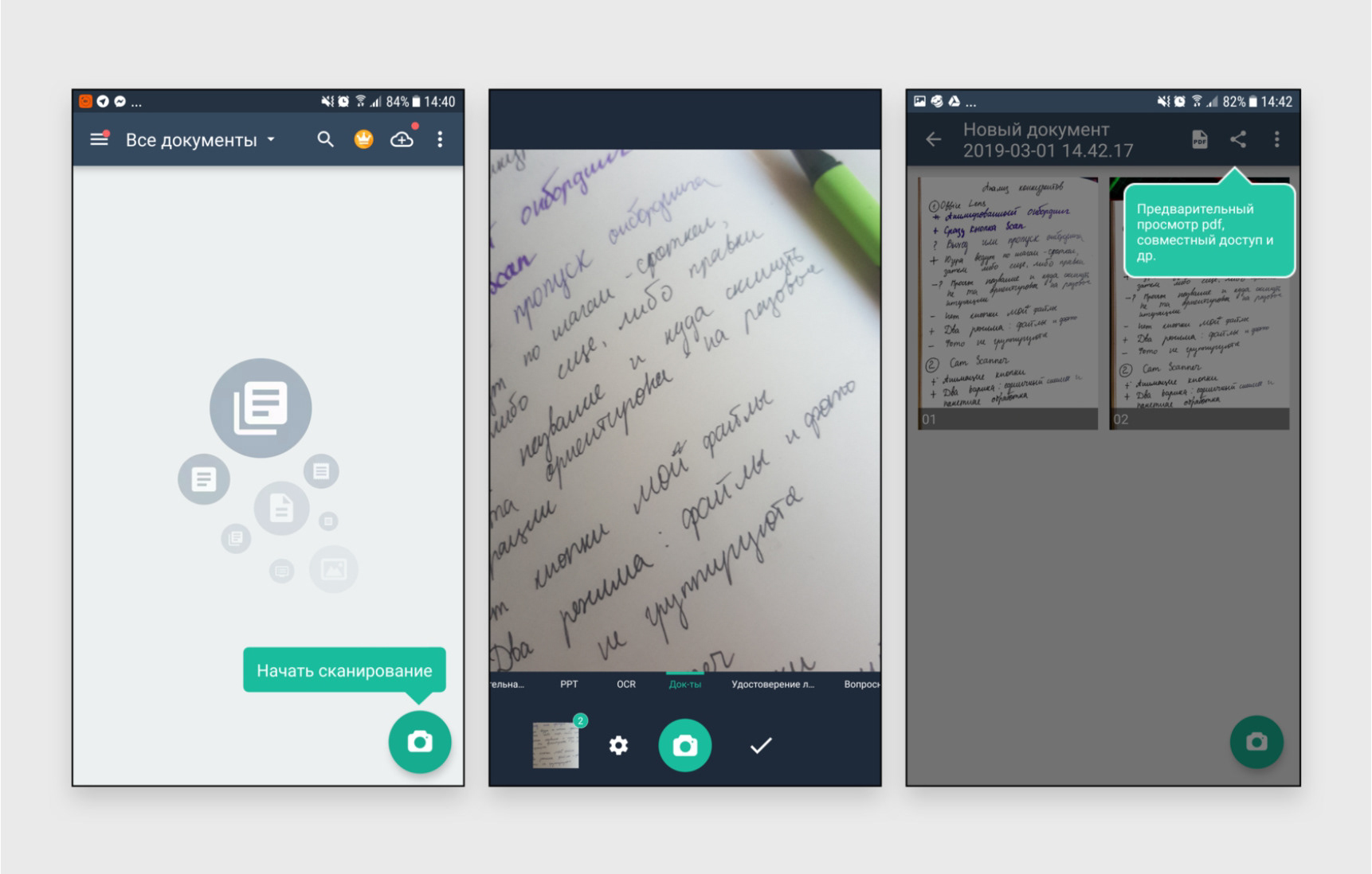
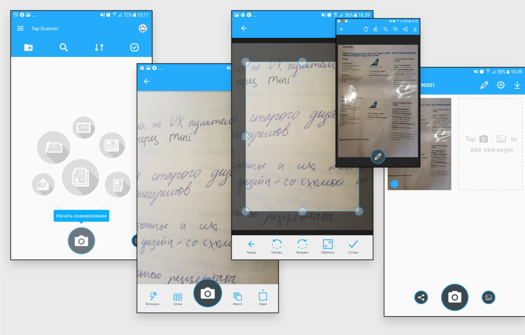
Tap Scanner
Again we see the accentuation on the button with the help of the funnel art. When there are scanned documents in the application, there are already 3 buttons - "Share", "Take a picture" and "Gallery", with a hierarchy in size. I liked the structure very much: the user is first shown the photo and the "Edit" button, and if he does not like the result, he already gets the editing functionality. Also, darkening around the frame works much easier for perception.
Take a look at the solution "one document or several" - icons as in the previous example, but signed. You can also notice that in order to minimize the user's search for the "Scan" button, the application uses a placeholder to add the next item. Convenient, but theoretically you can forget how to press FAB
#1.3 Interview participants
5 people used the Scanner Pro app under my supervision. Let's start by defining "Who, What, Why" for each person:
Who
Oleg is a young entrepreneur who is in the process of litigation in a case he did not want to talk about.
Oleg is a young entrepreneur who is in the process of litigation in a case he did not want to talk about.
What
Oleg constantly deals with documents for the court and he needs to keep them in order and safety. He has advised the Scanner Pro app as the best option for storing papers electronically.
Oleg constantly deals with documents for the court and he needs to keep them in order and safety. He has advised the Scanner Pro app as the best option for storing papers electronically.
Why
Oleg needs to quickly save documents, view them. OCR will also help you send texts to a lawyer. If he fiddles too long, photographing documents, or the process seems inconvenient to him, he will switch to a regular camera.
Oleg needs to quickly save documents, view them. OCR will also help you send texts to a lawyer. If he fiddles too long, photographing documents, or the process seems inconvenient to him, he will switch to a regular camera.
Who
Nellie is the Chief Operating Officer of a medical products company for beauticians. She constantly deals with contracts and lists, which must be kept until the conclusion of transactions or the conclusion of an event. She doesn't understand smartphones well and has a bad camera (old 5th iPhone)
Nellie is the Chief Operating Officer of a medical products company for beauticians. She constantly deals with contracts and lists, which must be kept until the conclusion of transactions or the conclusion of an event. She doesn't understand smartphones well and has a bad camera (old 5th iPhone)
What
Nelly needs a convenient way to store documents and send information from them to managers.
Nelly needs a convenient way to store documents and send information from them to managers.
Why
The application can save her time, it also compensates for a bad camera on the phone
The application can save her time, it also compensates for a bad camera on the phone
Who
Vladimir is a tester to whom I gave the Redeem code of the application) He has a trained eye that will help him not to miss the nuances that could be missed.
Vladimir is a tester to whom I gave the Redeem code of the application) He has a trained eye that will help him not to miss the nuances that could be missed.
What
Vladimir will need to scan the check and several pages of the abstract at my request
Vladimir will need to scan the check and several pages of the abstract at my request
Why
He is just interested in looking at a well-known application (and the first paid application on his smartphone)
He is just interested in looking at a well-known application (and the first paid application on his smartphone)
Who
Andrey is interesting as an interview participant because he does not have a smartphone, which also creates a unique opportunity to test the application.
Andrey is interesting as an interview participant because he does not have a smartphone, which also creates a unique opportunity to test the application.
What
Andrey will need to scan a check and several pages of notes at my request
Andrey will need to scan a check and several pages of notes at my request
Why
He's just as curious to click on the app he heard about.
He's just as curious to click on the app he heard about.
Who
Julia is a medical student who often needs to photograph books to repeat material in transport. She used the app for a while and uninstalled it. She has a large smartphone screen and a good camera.
Julia is a medical student who often needs to photograph books to repeat material in transport. She used the app for a while and uninstalled it. She has a large smartphone screen and a good camera.
What
Julia needs a place to store the photographed pages of the textbook in good quality, and the ability to write out separate phrases for the abstract
Julia needs a place to store the photographed pages of the textbook in good quality, and the ability to write out separate phrases for the abstract
Why
The convenience and speed of preparation for the exam depend on this.
The convenience and speed of preparation for the exam depend on this.
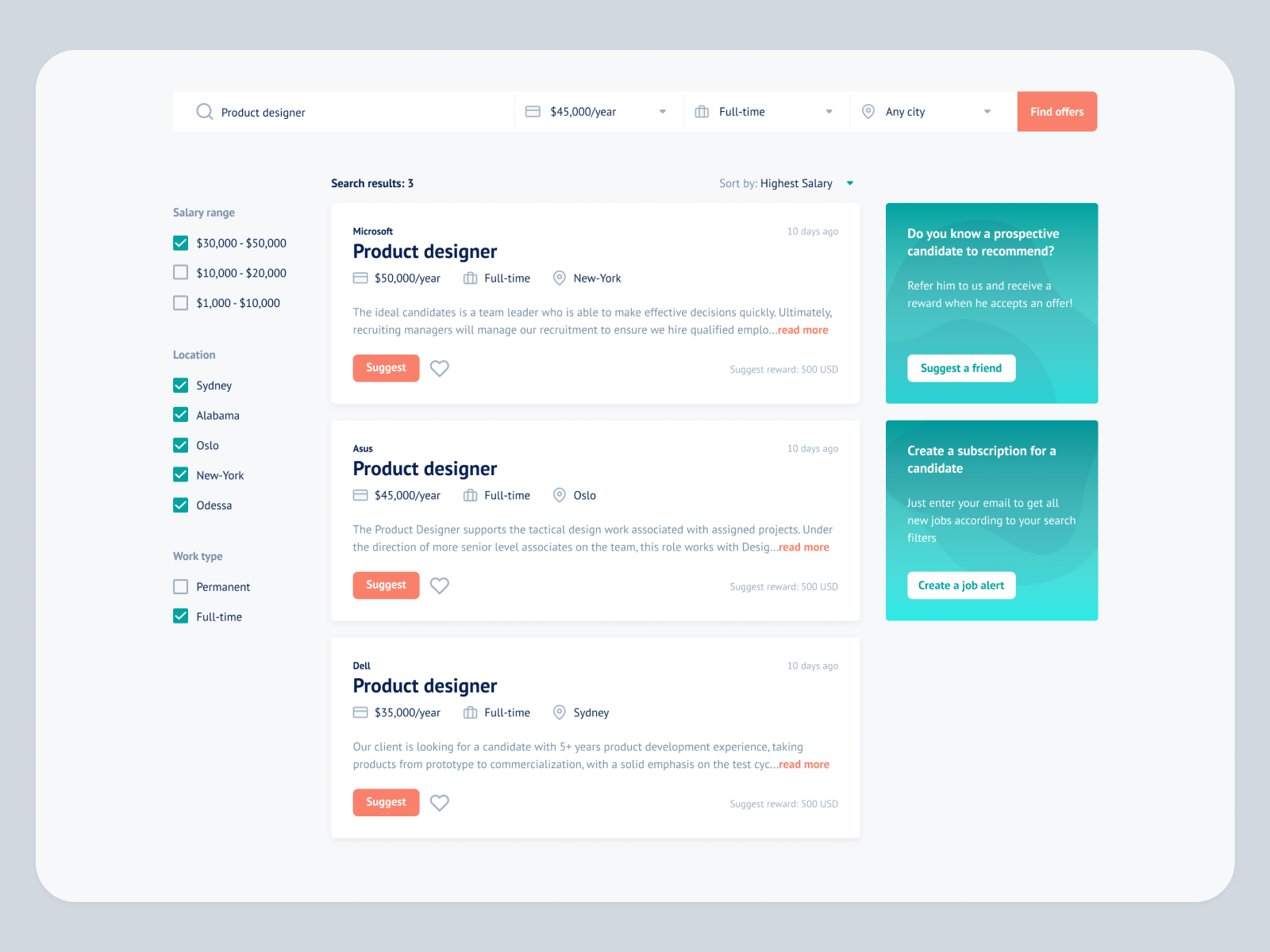
#1.4 Test results of the current product
Task:
New users of the application were given the following context:
You often have to photograph documents and you have a bad camera. Friends advised to use the Scanner Pro application, bribing with the ability to copy text and clear photos.
New and old users were given this task:
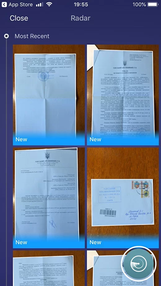
It is necessary to use the application to scan the receipt from the cafe, as well as 3 pages of the book to save yourself a long quote and add its text to your notes.
Later, an additional one was added to the task: Among the last photos on the phone there is already one photo of the book with the continuation of the quote, you need to add a photo to the stack with already scanned pages.
New users of the application were given the following context:
You often have to photograph documents and you have a bad camera. Friends advised to use the Scanner Pro application, bribing with the ability to copy text and clear photos.
New and old users were given this task:
It is necessary to use the application to scan the receipt from the cafe, as well as 3 pages of the book to save yourself a long quote and add its text to your notes.
Later, an additional one was added to the task: Among the last photos on the phone there is already one photo of the book with the continuation of the quote, you need to add a photo to the stack with already scanned pages.
I took notes of user experience from each screen of the current application and then wrote out the insights.
I also performed Empathy mapping for all personas (Says, Does, Thinks, Feels).
I also performed Empathy mapping for all personas (Says, Does, Thinks, Feels).
Screens of the app:
# 2. Adapting the application to new functionality
We create a high-fidelity prototype with improvements and comments, testing on 5 + 2 people.
I will show the screens to the previous 5 persons + people who have not seen Scanner Pro and will evaluate it from the point of view of a new user. I will bring a generalized conclusion from the observation of them.
I will show the screens to the previous 5 persons + people who have not seen Scanner Pro and will evaluate it from the point of view of a new user. I will bring a generalized conclusion from the observation of them.
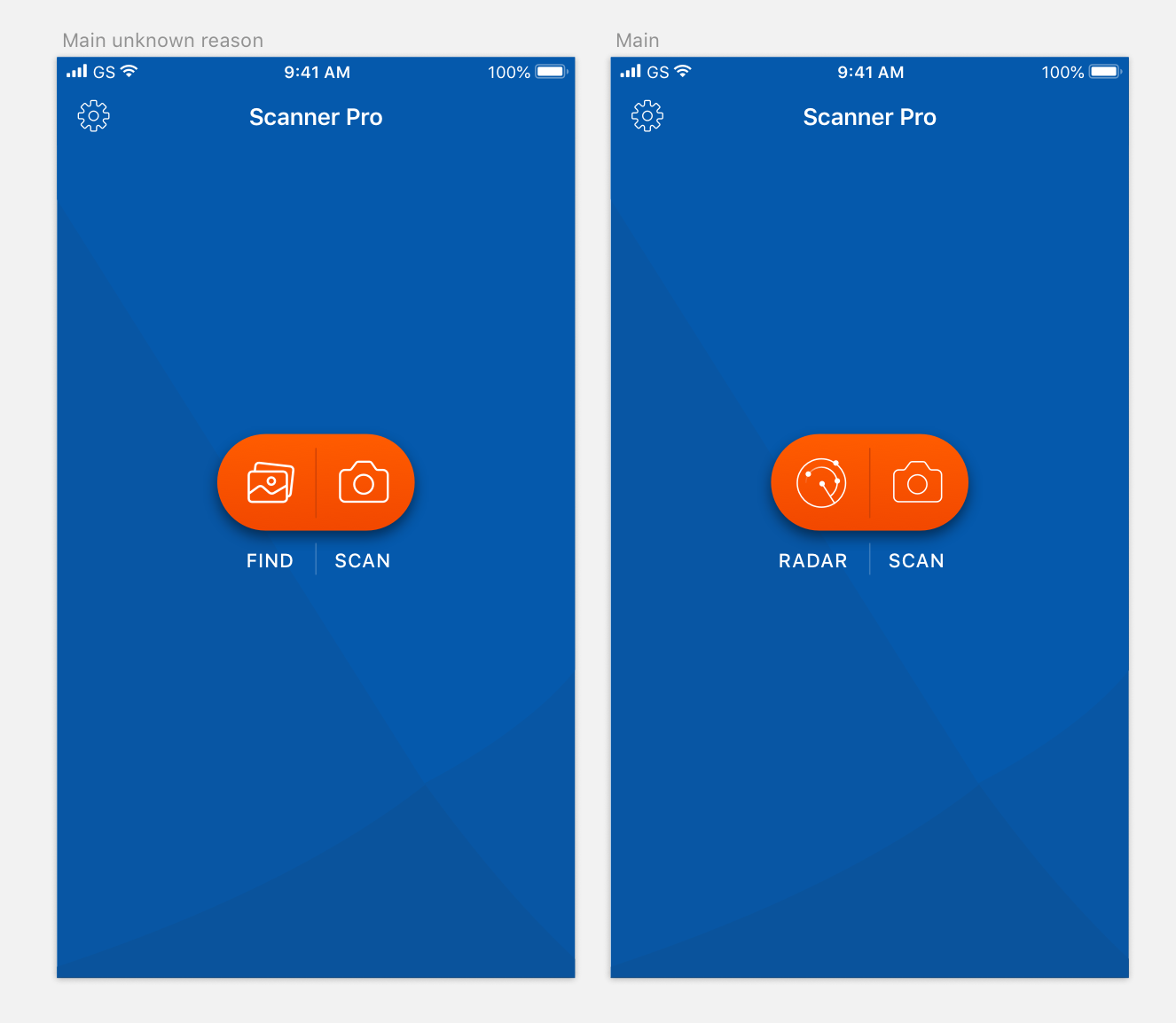
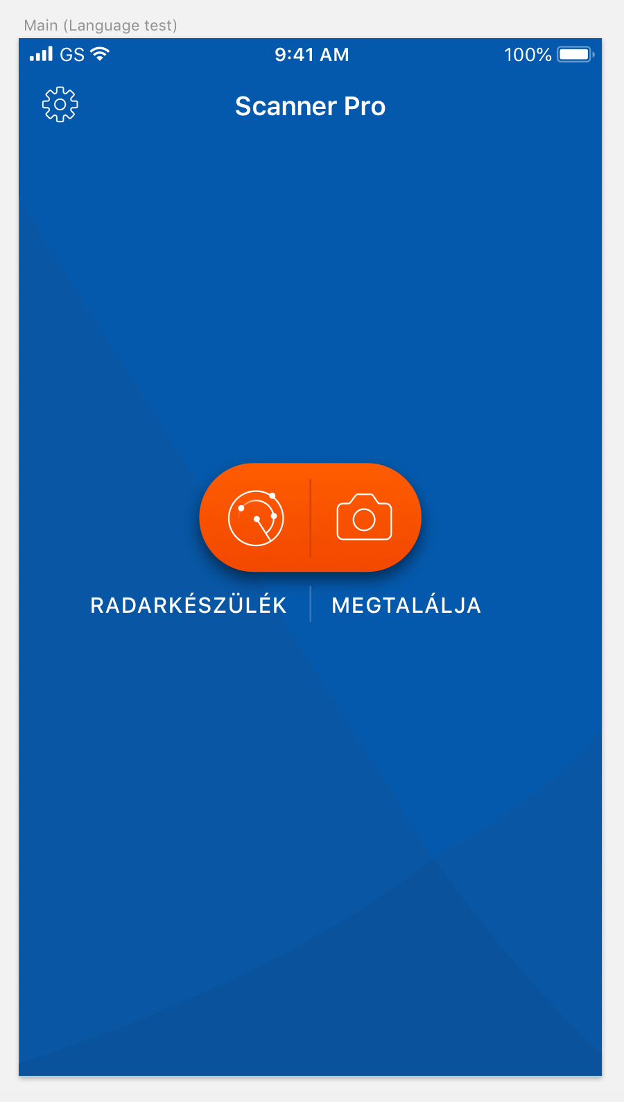
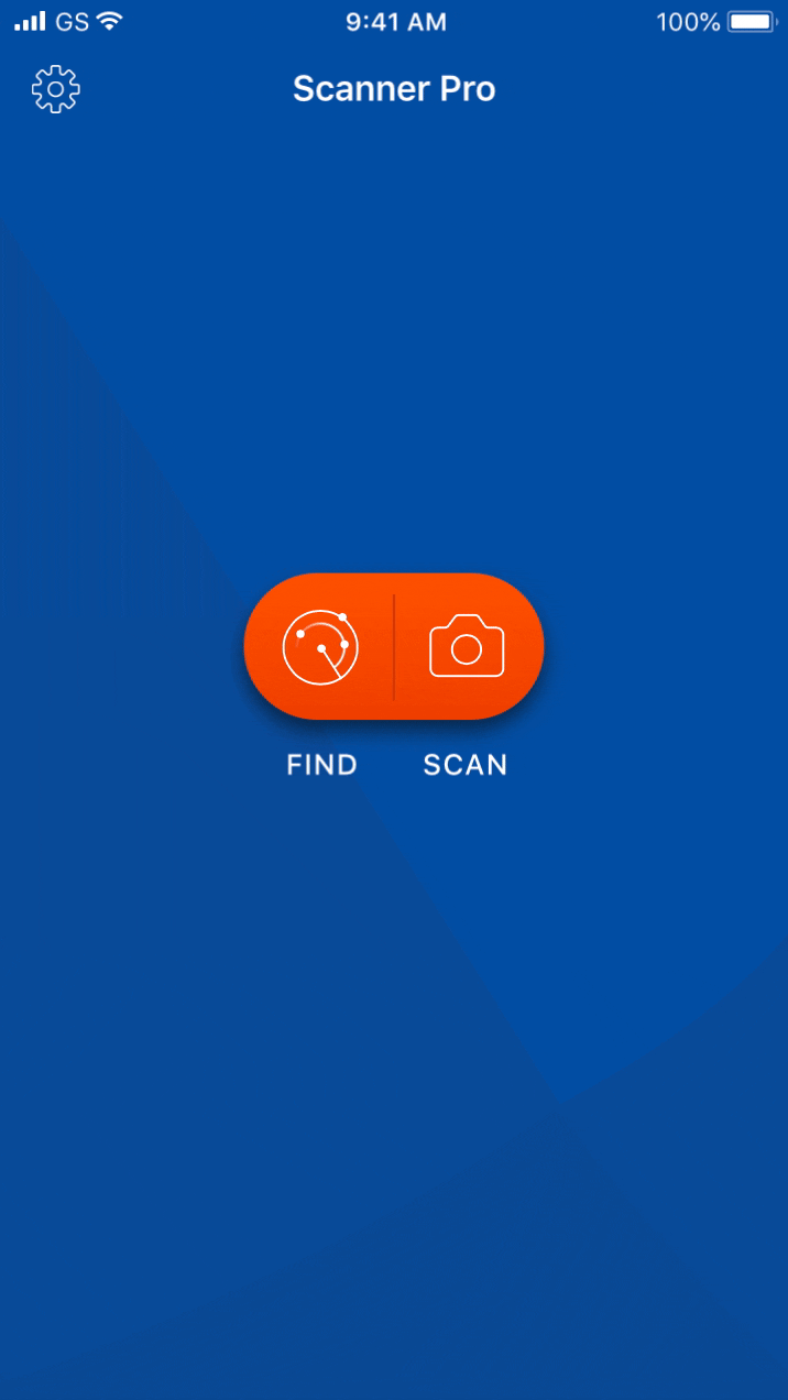
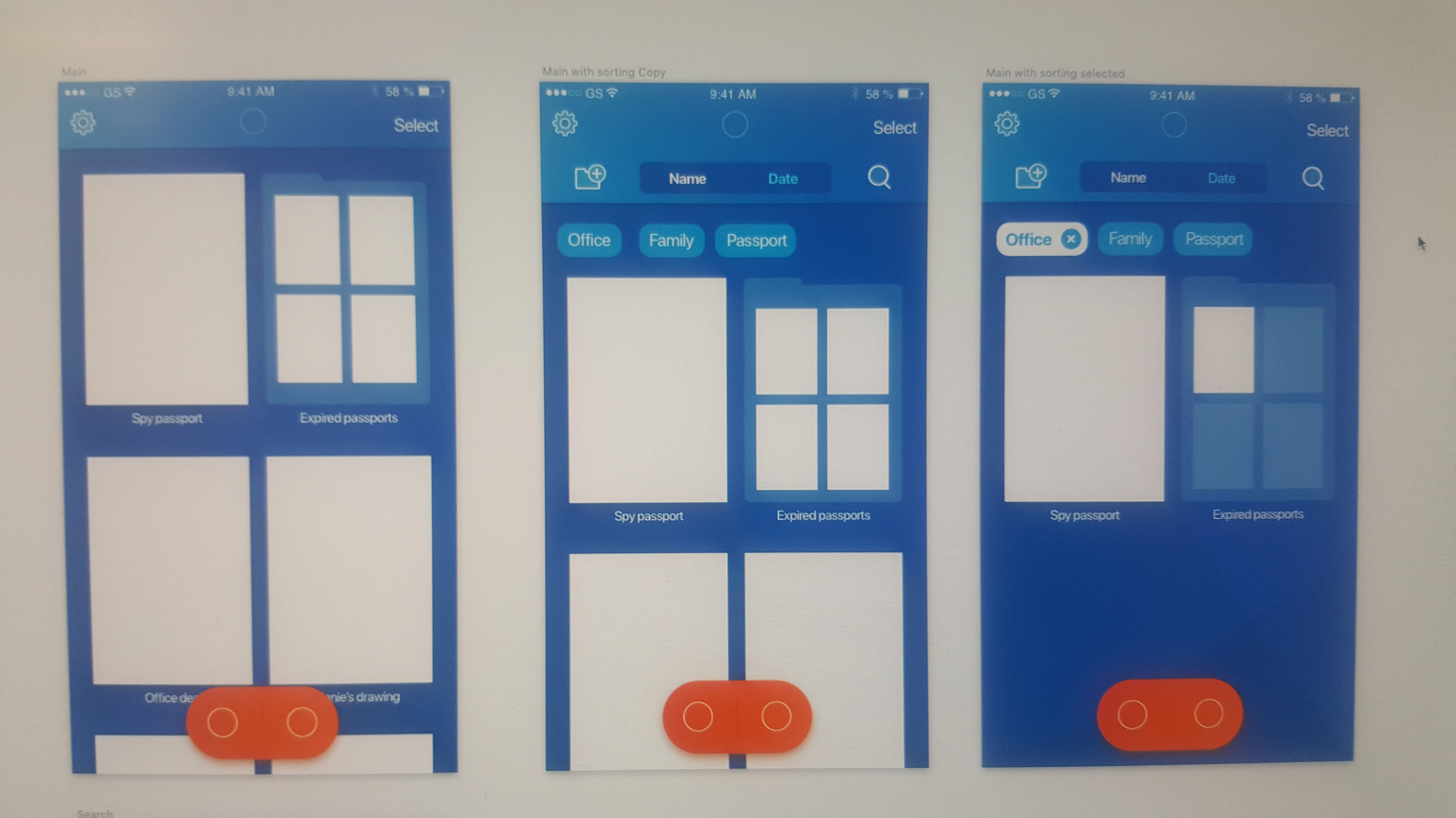
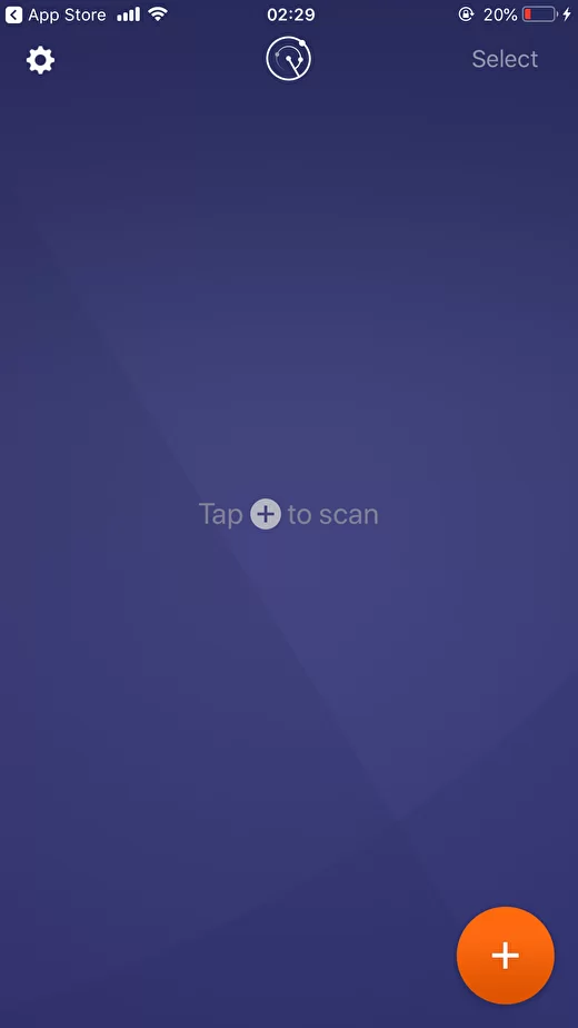
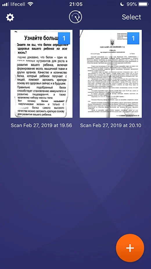
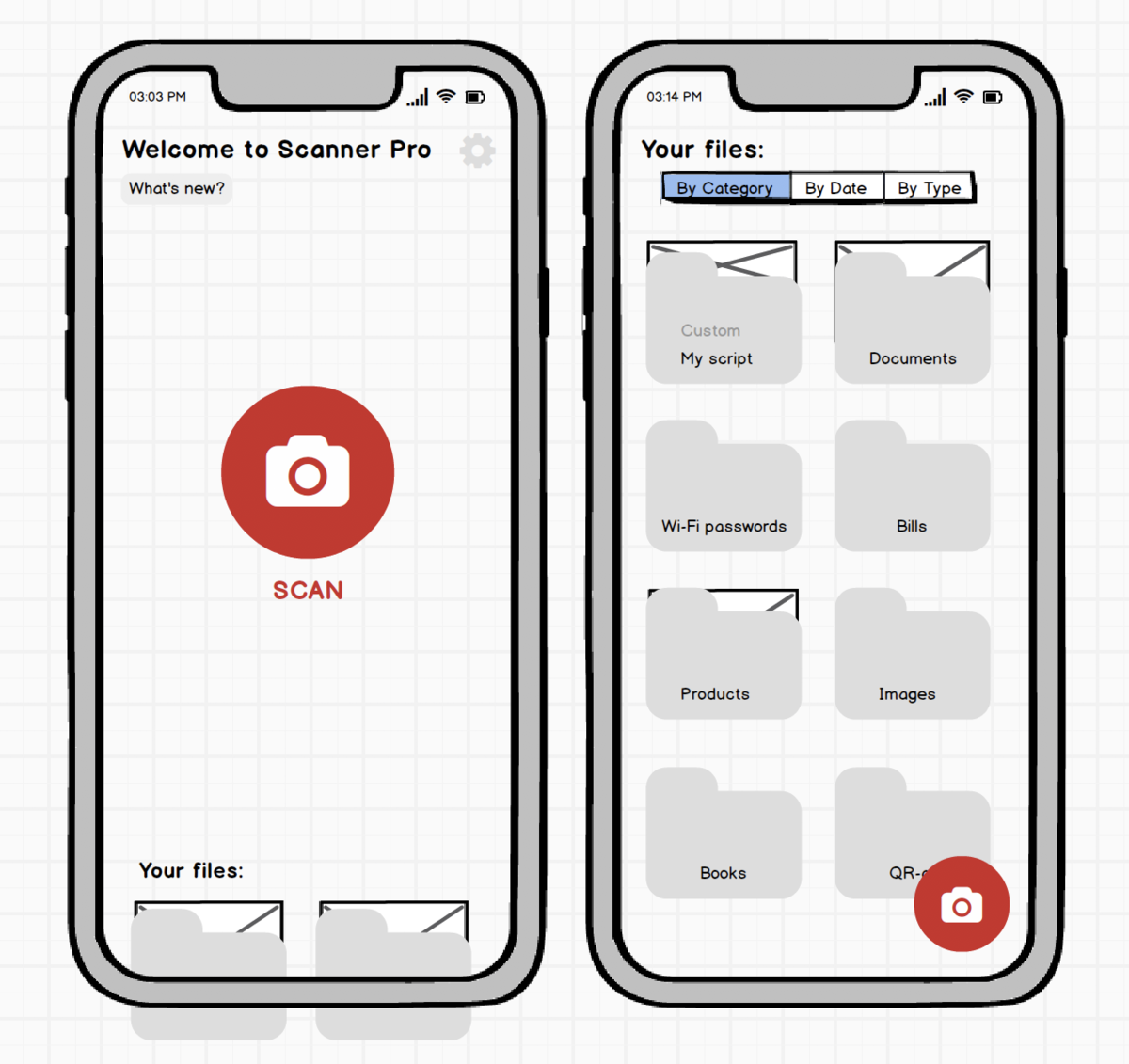
Home screen without documents
- I am a brand designer in the past, and I was surprised by the use of a purple background in the scanner when the application icon is blue. In the future, I would recommend making a general color scheme to improve brand awareness;
- Remove Select when there is nothing to choose from;
- None of the users understand what the radar means, and because of its placement at the top, they are perceived as a logo. Interesting functionality is randomly found by users.
5 users from the previous check + 2 new users clearly understood the first version of the screen, where the version of the icon from the galleries was used.
However, we need to educate users about the radar. Having entered there once, they remember the meaning of the functionality. To do this, you need to encourage the user to click on it more.
- Two main actions: find in the gallery or scan a new one - combine into one accent button;
An alternative option: at the beginning, show the user in all photos and inside offer to find documents with a radar. This is a hypothesis, an A / B test is needed;
- Buttons: Why not place buttons in the middle of the screen on a blank screen and add captions to "close the deal"? In Android, where FAB comes from, there are no signatures, but we are not in Android :)
- When the document appears, the animation shows where the button should go;
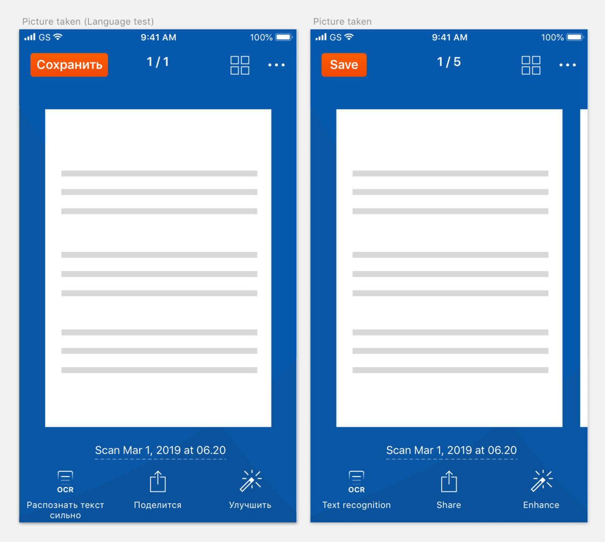
- Language test of labels. Usually, I use German or Hungarian for such purposes.
- Remove Select when there is nothing to choose from;
- None of the users understand what the radar means, and because of its placement at the top, they are perceived as a logo. Interesting functionality is randomly found by users.
5 users from the previous check + 2 new users clearly understood the first version of the screen, where the version of the icon from the galleries was used.
However, we need to educate users about the radar. Having entered there once, they remember the meaning of the functionality. To do this, you need to encourage the user to click on it more.
- Two main actions: find in the gallery or scan a new one - combine into one accent button;
An alternative option: at the beginning, show the user in all photos and inside offer to find documents with a radar. This is a hypothesis, an A / B test is needed;
- Buttons: Why not place buttons in the middle of the screen on a blank screen and add captions to "close the deal"? In Android, where FAB comes from, there are no signatures, but we are not in Android :)
- When the document appears, the animation shows where the button should go;
- Language test of labels. Usually, I use German or Hungarian for such purposes.
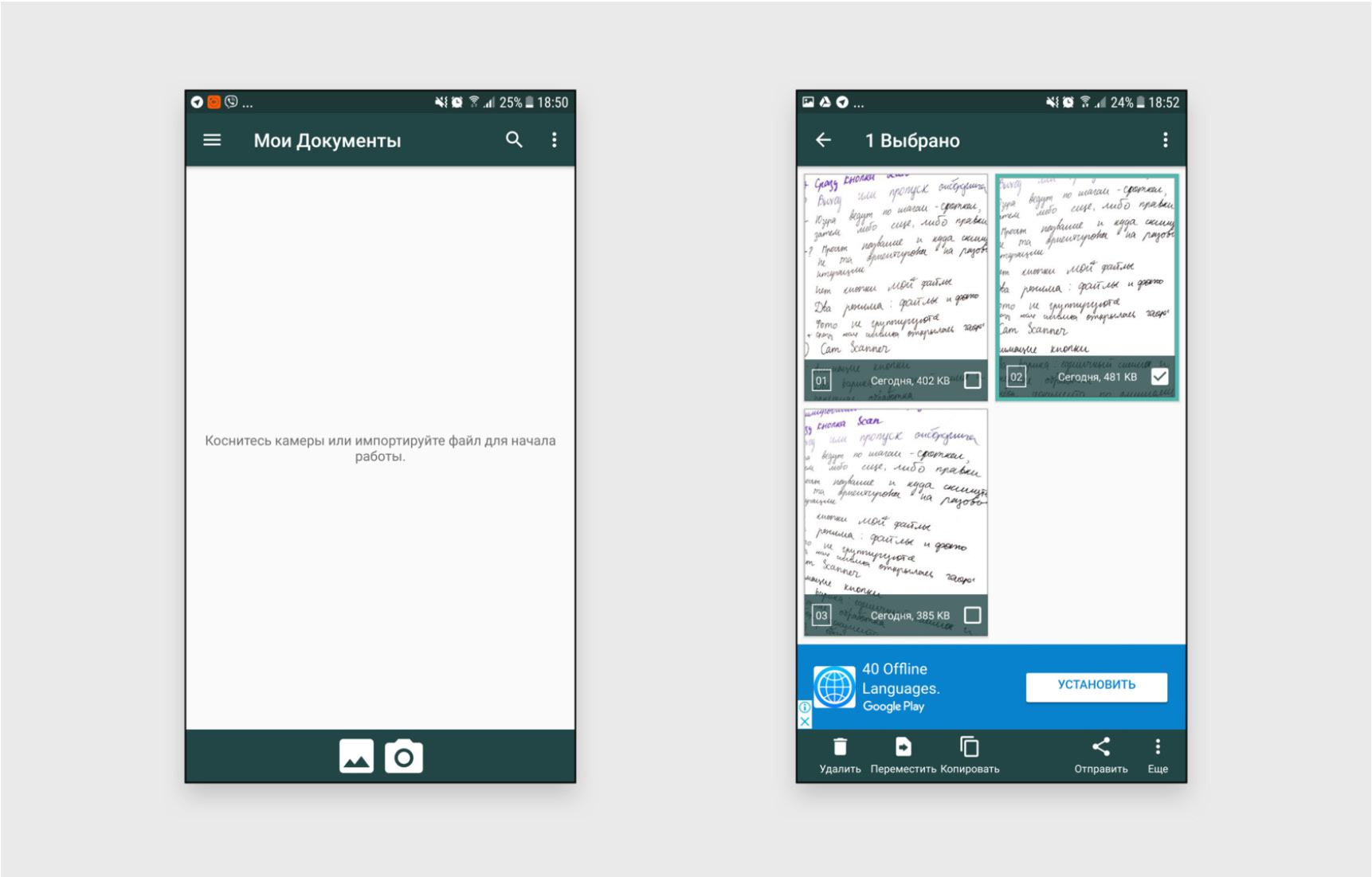
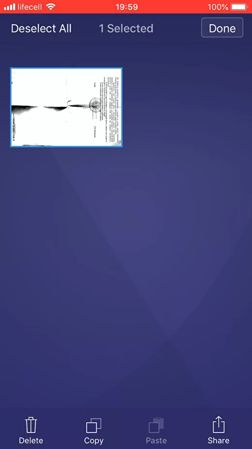
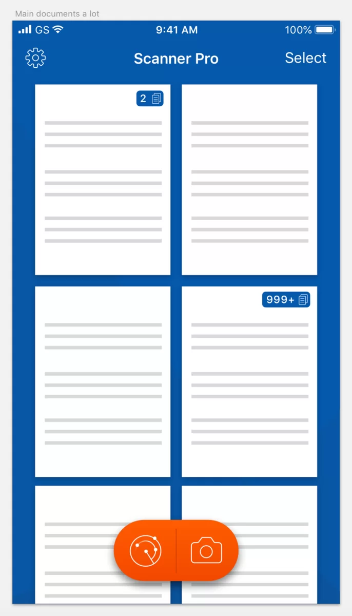
Lots of documents and stack marks
- The functionality of creating a folder, selecting, copying, and moving can be implemented using a long tap in Android.
Flow:
1. The user wants to select a document;
2. Does a long-tap;
3. Releases long-tap;
3. The document is marked with a checkmark;
4. The "Copy \ Delete" panel appears at the bottom (make a gif if I have time).
Flow:
1. The user wants to select a document;
2. Does a long-tap;
3. Releases long-tap;
3. The document is marked with a checkmark;
4. The "Copy \ Delete" panel appears at the bottom (make a gif if I have time).
Flow # 2:
1. The user wants to change the order of the documents;
2. Does long-tap and drag.
3. The documents jump depending on where he pulls the document.
1. The user wants to change the order of the documents;
2. Does long-tap and drag.
3. The documents jump depending on where he pulls the document.
I am an adherent of the idea that if there are 35+ among the target audience, the duplication of Select should be left;
- New icon for the number of files in the stack. It is advisable to use the same icon for stacks and documents for the entire application (examples below). The icon must be smaller than the scaled checkmark for long numbers. All surveyed users understood at a glance what the icon means.
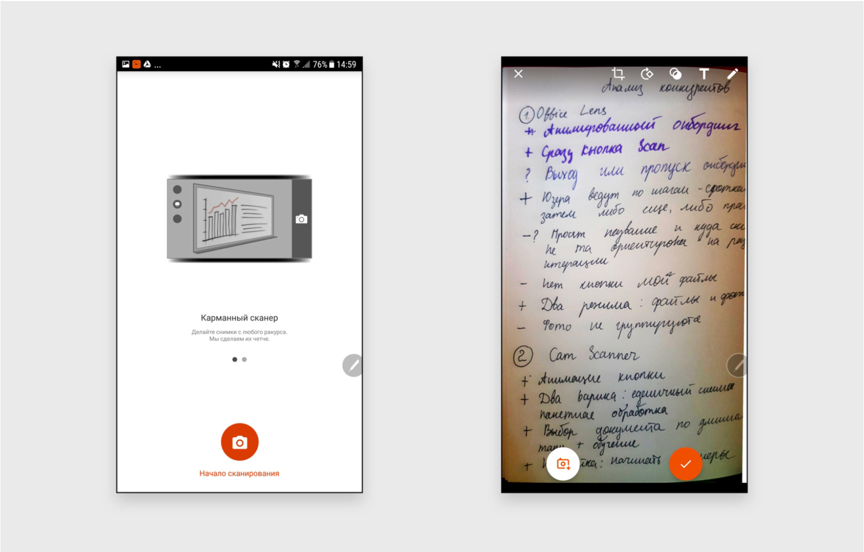
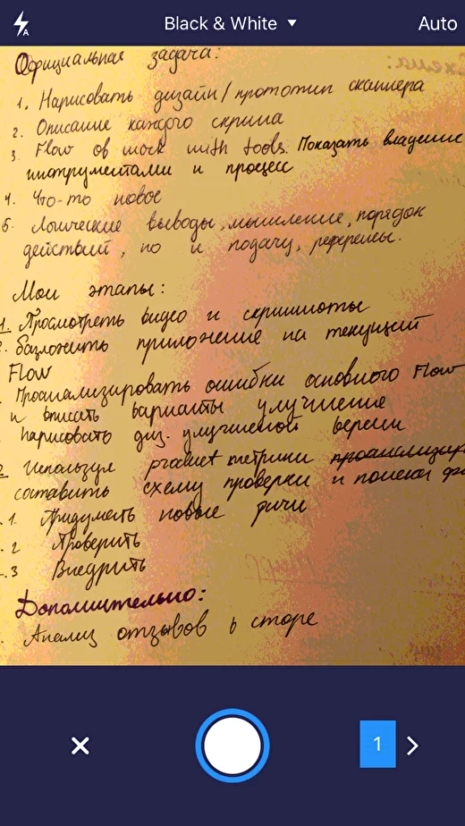
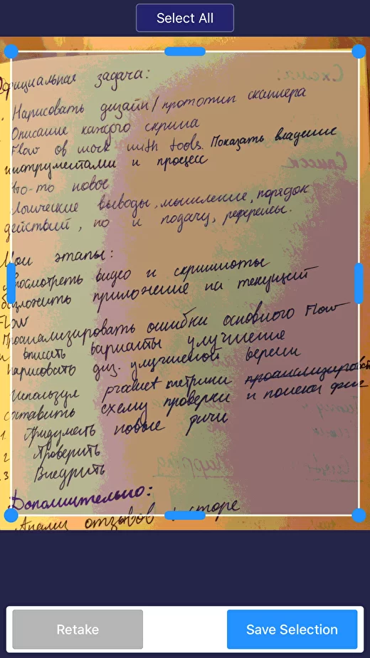
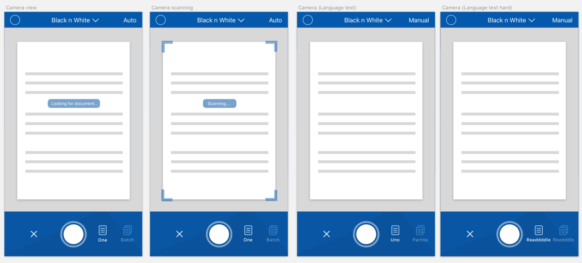
Camera screen:
- In AUTO mode, show the "Looking for document" checkbox, and change scanning and boundaries when it finds it;
- Users are having trouble creating stacks with multiple sheets. When using two icons and labels, the understanding of the functionality was 100%;
- With the Language test, no long words were found, so I added long text.
- Users are having trouble creating stacks with multiple sheets. When using two icons and labels, the understanding of the functionality was 100%;
- With the Language test, no long words were found, so I added long text.
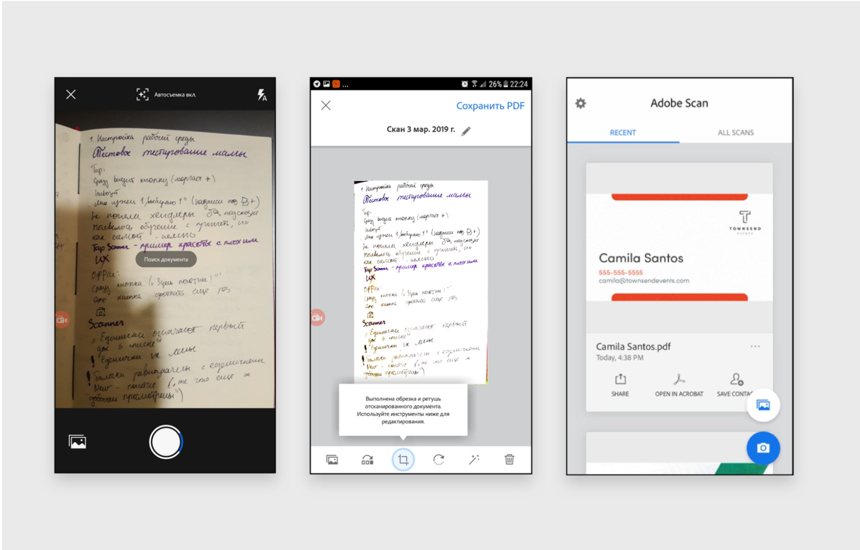
The screen of the photographed document:
- Increase the distance between the buttons at the top;
- Remove recognition from the menu, and add another page, on the contrary, hide there - thanks to the addition of icons to the previous screen, the likelihood that it will add sheets here is very small. I also want to note that none of the users used the "Add sheet" button when he had a task to make a stack, and he did not take a picture several times on the previous screen;
- I understand that they made an analogy with tabbar, but tabbar is a mean thing about the readability of the text. It is better to raise the icons higher;
- I suggest changing Edit to Enhance, because users expected to see there not an improvement in the quality of the picture, but the addition of inscriptions and cropping.
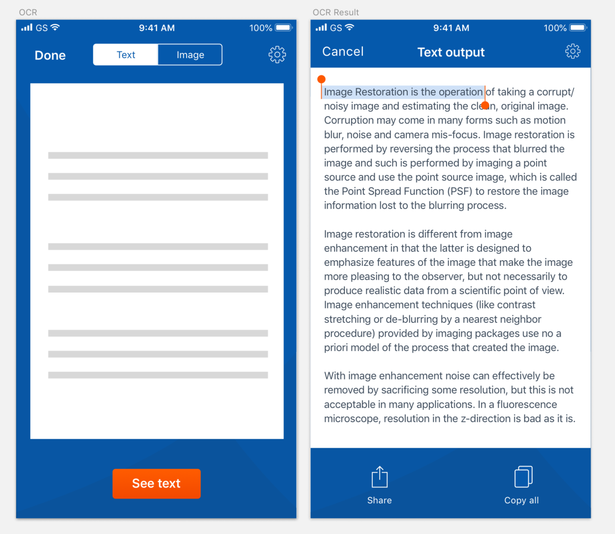
OCR result:
It is important for the user to see the text as a result, otherwise, he would not have chosen this function. Therefore, after scanning, I suggest showing the "View Text" button, where the user sees solid text with paragraphs and can select its individual fragments (the most requested function).

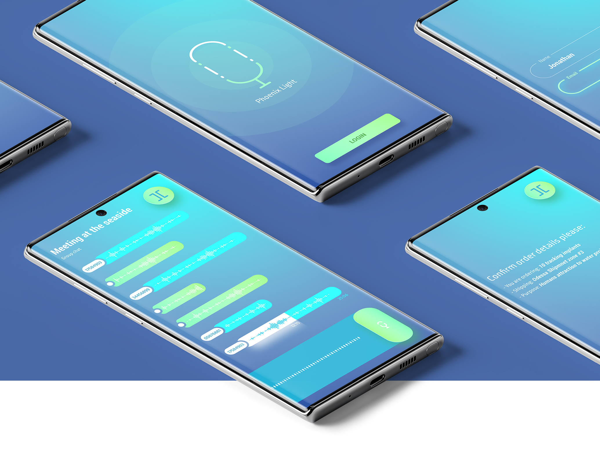
UI-concept, source file is lost
#3 Scanner Pro 2.0 Concept
I compiled a list of features that could be implemented and used in the future "Scanner 2.0" (if we could start from scratch and look into the future).
The word "Scanner" implies a range of associations that can be used to extend the capabilities of an application.
Let's take a look at technologies that already exist and work, and that can be applied to an application:
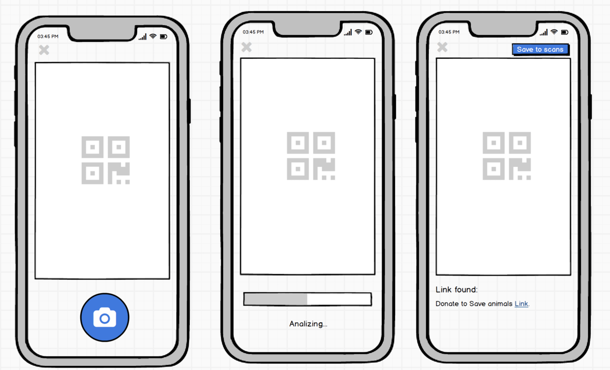
- Scanning QR code;
- Scanning barcode;
- Image enhancement thanks to Image Restoration technology;
- Scanning photos for objects - products, by analogy with Google lens;
- (conditionally existing) Popularization of OCR-sensitive fonts (OCR-A, OCR-B, MICR);
- (conditionally existing) Auto-detection of the pointer to the WI-FI password and automatic connection to it.
The word "Scanner" implies a range of associations that can be used to extend the capabilities of an application.
Let's take a look at technologies that already exist and work, and that can be applied to an application:
- Scanning QR code;
- Scanning barcode;
- Image enhancement thanks to Image Restoration technology;
- Scanning photos for objects - products, by analogy with Google lens;
- (conditionally existing) Popularization of OCR-sensitive fonts (OCR-A, OCR-B, MICR);
- (conditionally existing) Auto-detection of the pointer to the WI-FI password and automatic connection to it.
For the introduction of new technologies, a phased implementation is required, which starts with the target audience "Innovation Lovers", who will act as Opinion Leaders and disseminate information about the product. If the product successfully passes this stage, it will be necessary to adapt the product for commercial purposes, that is, create a need for it, possibly even in the B2B format. Once the benefits are formulated, the product can be mass-market and scaled up.
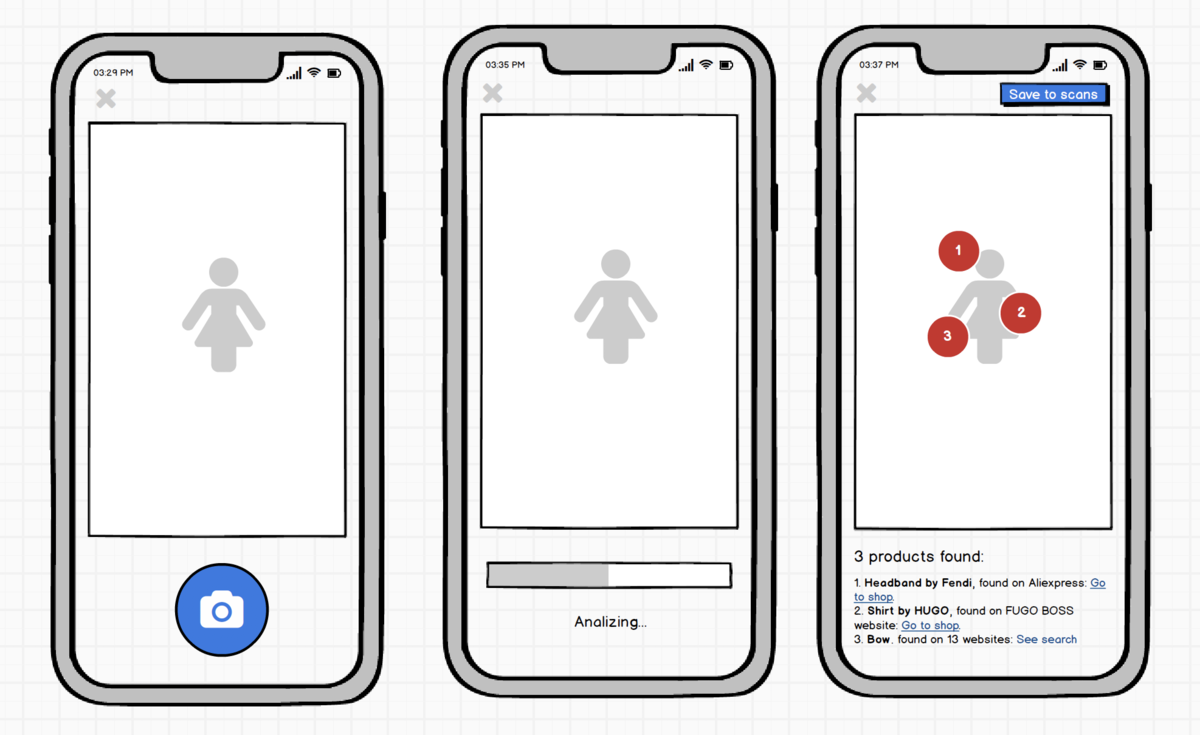
The first step the product should take is to prepare for auto-detecting objects on the screen. The design needs to be redesigned to group items scanned and found on a smartphone.
The problem is that by the time we adopt this technology at home, most likely mobile phone galleries will be capable of auto-detection. But this is the kind of functionality we need to strive for if we want to be a professional scanning tool.
The problem is that by the time we adopt this technology at home, most likely mobile phone galleries will be capable of auto-detection. But this is the kind of functionality we need to strive for if we want to be a professional scanning tool.
Google Lens product detection is not new, but it can come in handy for detecting images on documents and substituting appropriate ones.
Modernization of the formation of a finished document after OCR is a necessary functionality. You can use something like what Flipboard does - AI generates layout and photos for the article.
Modernization of the formation of a finished document after OCR is a necessary functionality. You can use something like what Flipboard does - AI generates layout and photos for the article.
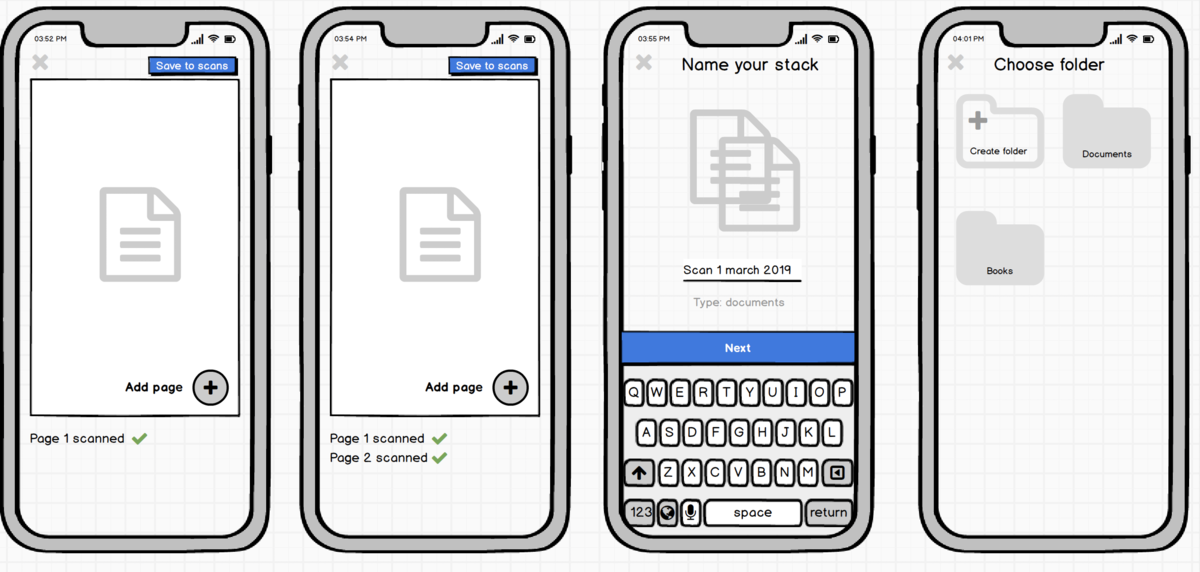
The "Take a picture" button will become secondary, the camera will itself determine what they want to show it, and the button will rather serve as a confirmation that the user needs this particular information from the whole volume of perceived information.
In this example, the "Take Photo" button has been removed, the camera waits for either for the operation to complete (Save) or continue (Add another page to the stack).
It is interesting that the steps for choosing a name and a folder can also be abolished - the name is automatic, the folder too. "Tidying up" can be delayed already on the screen of all documents, but this needs to be tested.
It is interesting that the steps for choosing a name and a folder can also be abolished - the name is automatic, the folder too. "Tidying up" can be delayed already on the screen of all documents, but this needs to be tested.
#4 A few words about responsibility
New technologies are fraught with dangers, which are difficult to foresee without dedicated work. It is sometimes almost impossible to calculate the consequences for humanity. However, you cannot ignore your trail.
It is necessary to take measures to preserve the privacy of users and inform them that their documents are reliably protected. At the same time, the Scanner of the Future can detect real threats, terrorist plans, or schemes of weapons of mass destruction in the text. It is a mistake to think that we are not responsible for the world that Scanner can create.
Provision should be made for the theft of copyrighted texts and images, and not to capture people or transfer such information to statistical tools.
And the main thing is to identify the benefits that the application can bring to society and contribute to its popularization. After all, a product without benefit or joy creates a dangerous world in which our children will live.